
Perhaps you haven’t heard about the house paint color saga over here during the past two months? I’m quite certain J. is ready to divorce me over it by now, but we are so, so, so, very, very close to having a completed and fully painted home. And was all of the angst worth it?
Absolutely.
Last summer we started noticing how much our house needed a fresh coat of paint so I started squirreling tax refund money away (painting a house is EXPENSIVE when you don’t diy, and this is one project I will never attempt to do-it-yourself!) and we’ve been on the hunt for paint colors.
Those of you who have been around the block with me a few times know that I am SO not very decisive when it comes to picking paint colors. I love to look at them, debate them, and am always finding colors I like…I just can’t decisively pick a color to save my life.
Finally we narrowed it down to a color scheme that we liked on a house just down the street from us…also a Spanish style home with a lot of black wrought iron accents like ours. I have always liked the house, it seems homey and “well-put together” (can a house be well-put together?) with a nice neutral scheme that can work with a lot of different accent colors.
Yes, I suppose I could have gone up and just asked them what their taupe base color was. And yes, I suppose that would have saved me countless hours of agony. But it just felt a little creepy in a stalker-I-want-to-totally-steal-your-house-paint-color sort of way, so instead I sample painted up almost every corner of our house. Each day Jason (our friend who painted for us) would stop over or J. would come home, and they’d just sit and shake their head at me. In my defense, it is really hard to imagine what this tiny patch of paint will look like on a two-story, huge expanse of stucco. It was nerve-wracking. I did not want to get the color up there and find out too late that the taupe was “too poopy colored” or that it looked like a penitentiary because it was too gray.
Finally on the very last day before we left for our Michigan trip, I basically did an eenie-meanie-miney-mo between the two colors I had narrowed it down to, and voila! Garden Wall by Behr it was.
So we left and when we returned found that our freshly painted house looks like an entirely brand new home.
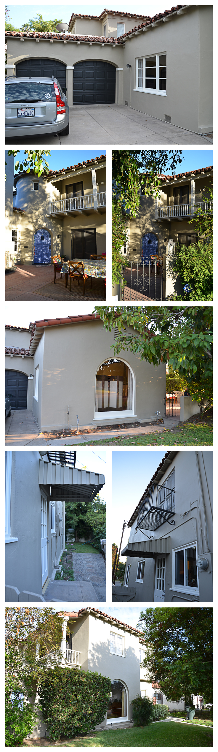 A variety of shots in many different times of day/light. I couldn’t love it any more if I tried.
Wellllll….that’s not entirely true. Jason had said that the front door really needed a “pop.”
If it was black (like it was supposed to be) it would be way too black hole-ish (yes, he did use that word) in the courtyard since we did all of the french doors in black. So he suggested the blue that is in our tile around the fireplace (bet you never even knew that tile was there, did you? NOW you see it. It is actually accented and so pretty!) and I said, “go for it.”
I didn’t love it. I didn’t really even like it. It was so…bright? Vibrant? BLUE?! So we toned it down and took the green color out of the tile, especially since I have a lot of vintage green pots and courtyard goodies already and just darkened that up. I actually haven’t seen the end result in person yet. We are on vacation (yes, again!) and Jason just texted this photo to me, but I think I like it better already.
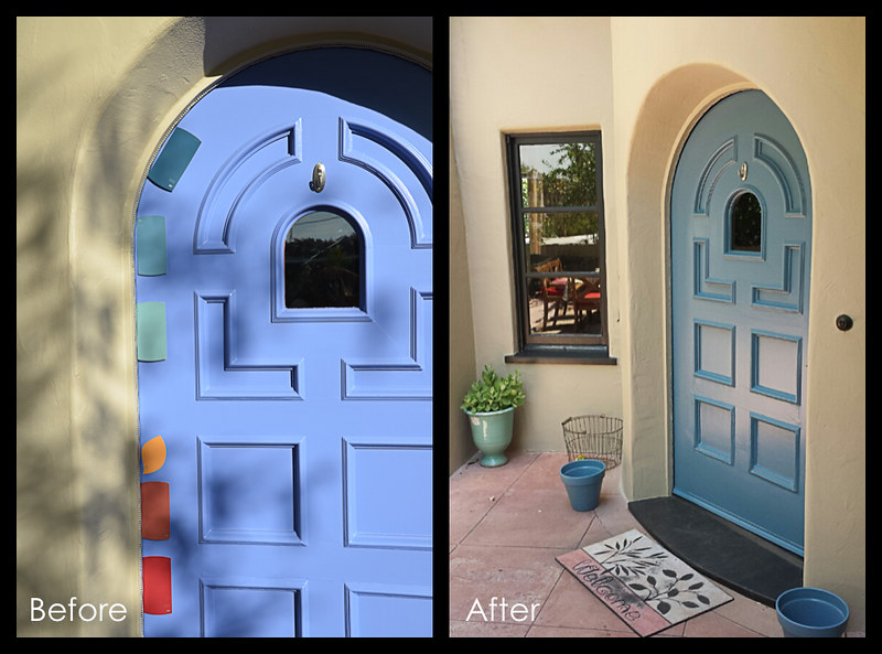
Yes, as you can see…that is just one side of the door, we totally had another 2 week long debate on colors just for the door, too. The light green-ish one you see there in the before shot, third one down, was our winner for awhile. It is close to the pot I have in the corner under our mailslot there in the “after” photo. But I worried that it would be just too “bright” too, especially with the more subdued taupe and blacks we had going on. So we went with Catalina Coast there in the middle.
What do you think? I think I can’t wait to get home and see it in person. And I think that I never want to paint the house again. For not doing any of the “real work,” this project sure was exhausting.
The house looks great! And I totally agrre with getting rid of the Blue for GREEN!
Go Green!
I think the blue is perfect!!! What a lovely color!
It is more blue than green, dad. 😉 We will always be more blue than green. Emma calls it “terrible teal!”
I loved the blue, but I also like the green/teal. And it is more subtle. Unlike me 🙂